Information Graphics
For workshop 3 we learned about information graphics.
We learned about a student called Sarah Jane Cassell who chose to map her closeness to each family member through a series of lines.
For our task we had to create a life story using colour and graphical representation to represent the important people in our lives and significant life events
.
After creating a plan of what I was going to do on paper, I decided to do my final piece in Illustrator as I found it looked more professional and neater.
Last week in workshop 3 we started out brief for typography and watched videos to broaden our understanding.
This week we started to create our own typography by looking at work from other people and trying to identify letters, whether they are lower case up upper case, using a ruler and a pair of compasses we roughly drew the letters we found.
I looked at work from Joseph Binder, Wyndam Lewis and Herbert Bayer.

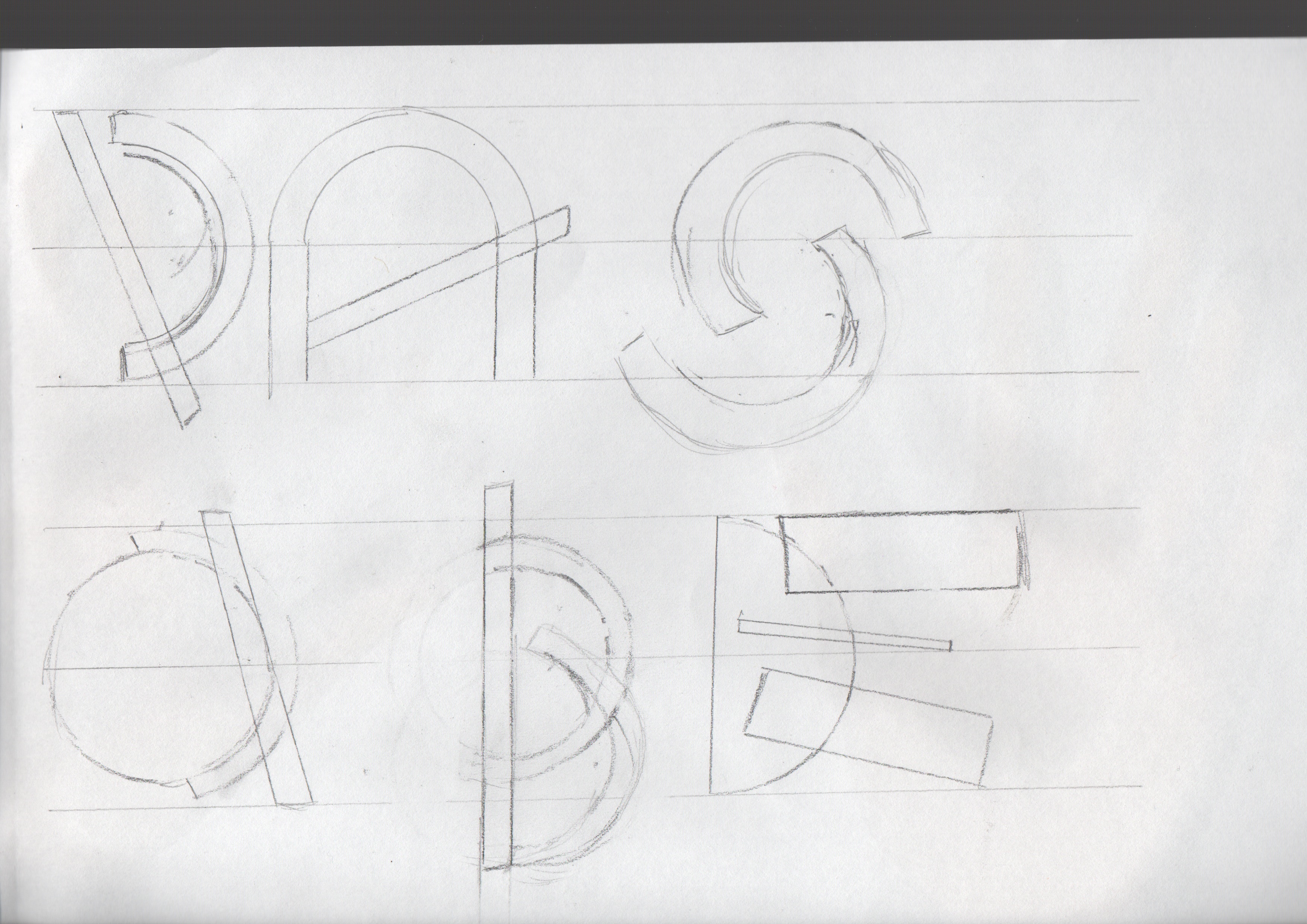


Carrying on with the typography work, I started to develop the letters I had found within the images.
I started by choosing one letter and creating as many different styles as I could. I did this with several different letters to see whether or not the styles would work. Here is some examples below, the letter A, C and E.


To get a stronger sense of sizing and precision I started to draw my favourite idea onto graph paper, and did this for the whole alphabet. I created two different versions of this style, one thin and one thick. This is shown below.


Once I was happy with my alphabet I decided to scan them onto my computer and open them up in illustrator. Using the pen tool I drew around the letters and used grid lines to make them straight. I feel that this made it look more professional and I was able to make them more accurate and straight. Some of the letters are shown below.

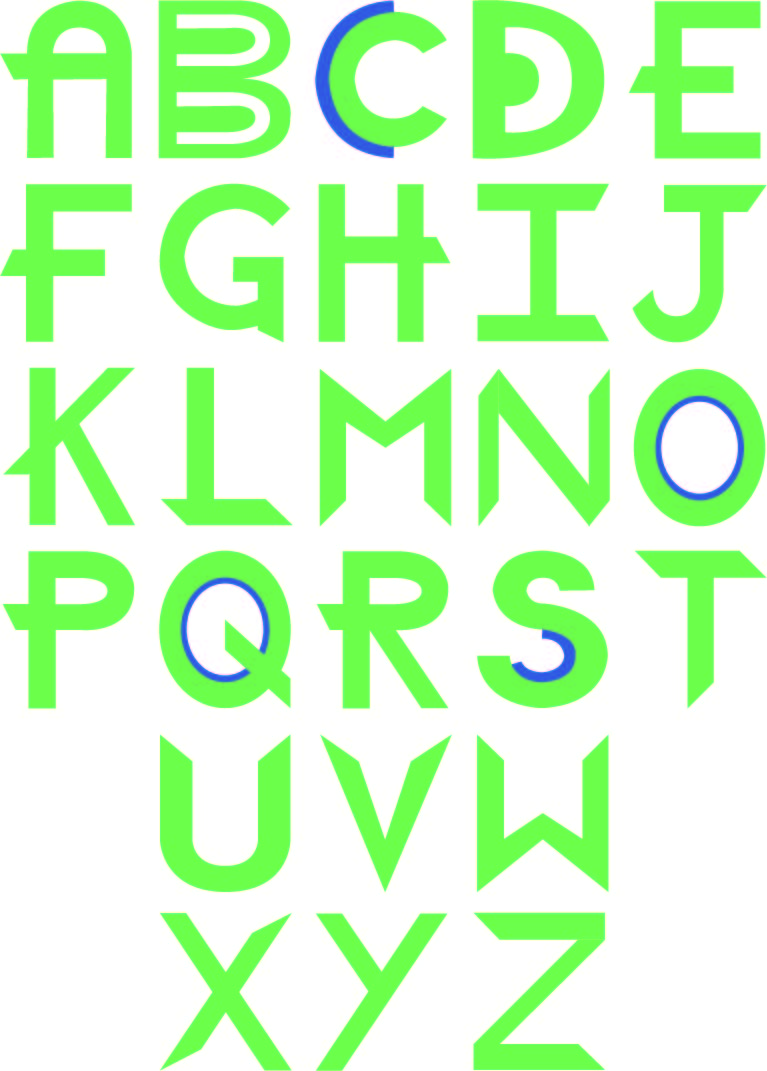
Here is my finished typography. Using Illustrator I aligned all the letters so they flowed better and looked more presentable. I added the colour green, and where there was two layers I added the colour blue as well. I chose these colours because it is what looked best when putting this work into my New Visual Language magazine.
Icon Story – Part 1
Today we were given a series of different images with a word written underneath and our task was to create a short story using them.
The aim was to see how creative we could be in an hour. We had to cut the pictures out, and then stick them in order for the story.
Here is mine.

Icon Story – Part 2
Today we carried on with the icon story. Taking inspiration from the week before, we had to create our own icon story that was relevant to todays times.
My story is based on underage drinking and house parties.
Here is mine.

